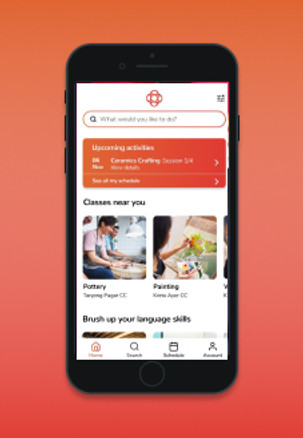
A service redesign project
The challenge
In a digital age where apps like Classpass and Meetup have become popular sites in the playing field, user expectations have evolved. In this service redesign project, we venture to identify pain points and service gaps. Thereafter, we presented game-changing solutions for OnePA.com, a local course provider at community clubs islandwide.
Project Timeline: 2-weeks
Team: 4
My Role:
-
Site Visits, User Interviews
-
Usability Tests
-
Identify Persona & Pain Points
-
Customer Journey Map
-
Identify Silos in Service Flow
-
Ideate Solutions
-
Design Wireframes & Interactive Prototype
Tools: Miro, Figma, Adobe Illustrator
Interactive Prototype
The Original Site
...and its problems identified through 15 Interviews, 5 field visits and 3 usability tests of the current onePA website.

90%: I can't search for activities at my location!
Search bar only detects
Community Club names

60%: Course information tends to be unclear. I have to call the helpdesk to be sure.
Inconsistent course information across vendors. Layout varies from page to page.

60%: The payment process is too tedious!
40%: I always take a long time finding the classroom. There are not enough directories or signages.
4-Steps Payment Process


Defining Target Audience
We conducted 15 Interviews, 5 field visits and 3 usability tests of the current onePA website.

Helen, our Primary Persona

site visits
We observed inconsistent directories and a long line at the onePA helpdesk. When asked why people did not choose to use the website instead, they expressed frustration and confusion.
"It is much easier to register at the helpdesk
than online." - Attendee at a Community Club


The Analysis
empathy map

service blueprint


Usability tests
Using the international measurement of System Usability Scoring, we surveyed users on the original website, our first prototype, and iterated, second prototype to see vast improvements.
We pushed the user experience ranking up from D to A!


learnings
Design with minimalism and clarity as a priority. In the prototype, I was in charge of doing the search results and filter part of the app. I decided on a calendar feature for a choice of the course date, with a time range slider as I wanted users to have maximised convenience to choose both at the same time. However, as the designer, it was hard to anticipate that it would turn out to confuse users instead. Hence, I realized that if there was the slightest uncertainty in the feature's ease of use, it is not intuitive and should be reconsidered.


